Amateur astronomers learn to love the dark.
Unlike the rest of the human species we enjoy seeing the night sky and have learned not to fear the darkness, rather to embrace it. This phlisophy is carried over to our devices as well. We set our computer screens for minimum brightness with red on black color schemes. We understand dark adaptation and what it means for our vision.
You may note that Darker View uses a dark color scheme. This is not by chance, there was a great deal of thought put into the light on dark color scheme here on DV, with full understanding of the advantages of dark on light schemes.
Many people do not like light on dark schemes, avoiding websites that use such colors. Other folks far prefer such color schemes, particularly people who spend long hours at the computer, programmers and CAD technicians in particular. Programming environments and CAD software make switching color schemes easy, understanding the personal color preferences are critical to good software useability.

This is where the problem with the new iOS 7 becomes apparent…
iOS 7 is too bright.
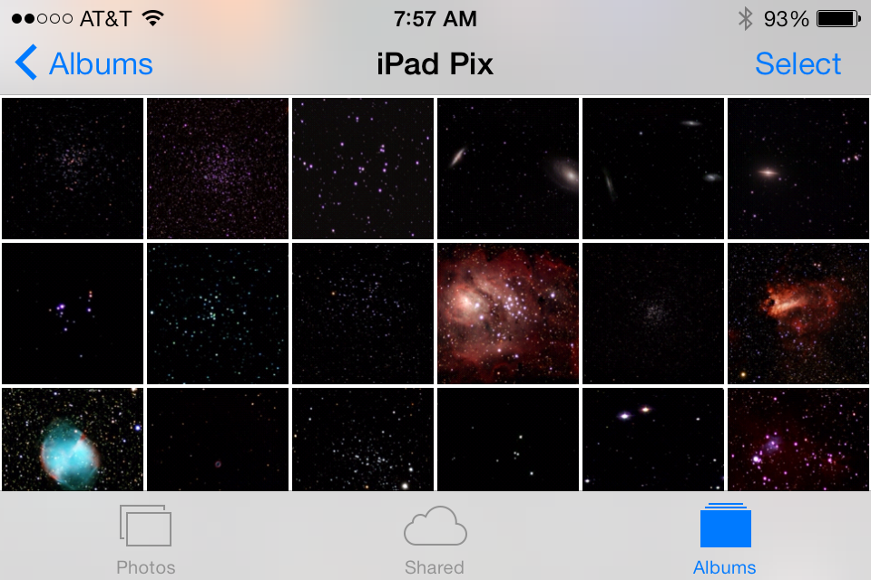
I love the dark color schemes of the older iOS versions. The dark grey color scheme is a beautiful backdrop for photographs in the Photos application. It is ideal for showing astrophotos when talking to the public beside the telescope. The new scheme is simply awful for this, displaying the photo with a bright white border.
Several of the native applications have changed from a light on dark to a dark on light scheme. In particular the photo applications. the backgrounds for many of the elements in the home screen and other commonly used areas have likewise gone bright. Applications that are designed to be used in the dark, planetarium programs like Sky Safari and Star Walk will have more control, keeping it dark. I can no longer pull up a photo to show a guest at the telescope without a blast of white light.
This is more than a problem for amateur astronomers. Anyone who operates the device in a low light level situation is going to notice. Many places where iOS devices are used feature light levels where the new, bright white displays are troublesome. Reading in bed with the lights off? At night in a vehicle trying not to distract the driver? A dim lecture hall while presenting with Keynote? I am only guessing here, but I do guess that complaints about the brighter color scheme are piling up at Apple.
There are other reported problems with the operating system. The extensive use of animations is proving to be too much for some people. Users report vertigo and nausea from using the devices. It appears that the new animations also create a notable performance hit on older devices, with annoying delays. A coworker of mine complains that she can no longer read the time without her glasses, due to the thin font used in the opening screen. With operating systems it is the little things that count.
Fortunately I was warned by several friends not to upgrade. These warnings caught me in time, partly because I have learned to wait when it comes to major upgrades. Currently both my iPad and phone are at revision 6.1.3 and holding. There is usually no downside to waiting a little. Let the dust settle, let the bugs be revealed before upgrading. Sooner or later I will be obliged to upgrade, hopefully after someone at Apple actually listens to the customers and comes up with a better solution.