Of Green Stars…

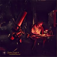
Wandering the sky using a telescope and a field guide published in 1844, the better part of two centuries ago, is… uhhm… interesting. In mid-April the classic winter constellations are dissapearing into the sunset, with constellations like Monocerus and Puppis well placed for observing from my driveway just after dark. On my observing table is a reprint of that 1844 field guide, The Bedford Cycle.

At the telescope in the driveway again

Working through the entries I come to the entry for a double star Argo Navis 72 P. VIII, a designation from a very old catalog. It takes a few moments research to convert 72 P. VIII to the slightly more modern catalog number HD 71176. Modern? The Henry Draper Catalog was first published by Harvard Observatory in 1918, still over a century ago.

With the HD number I can look up the position on a modern chart and spend a few moments star-hopping the Astrola to the correct star. This double star is now located in the constellation Puppis after the ancient and absurdly large constellation Argo Navis was broken up into Puppis, Vela, and Carina.

Continue reading “Of Green Stars…”

Correcting a Baader Solar Film Solar Image

Take a photo with a thin film solar filter and you get a blue-white image of the Sun. Correcting this to a yellow gold image is fairly simple in most any photo processing package.

Baader Film Solar Image
The Sun as photographed through a Baader film solar filter
Correcting is probably the wrong word here. The Sun is actually closer to white as we define color. After all, the Sun is our normal source of light, what our eyes evolved to use.

Color is a fluid subject, simply our interpretation of frequency across a very small slice of the electromagnetic spectrum. As such there is no absolute right and wrong, just a set of conventions we normally use.

The issue is that people expect the Sun to be yellow-gold. Present an image of the Sun in any other hue and it is rejected as fake, or false color. We are accustomed to certain visual cues to identify and interpret our world, color is a major part of that. Unless you want to argue with a million people or two, you are better off making your Sun photos yellow-gold.

Continue reading “Correcting a Baader Solar Film Solar Image”

The Sola Photo 800 Dive Light

Once you descend below a few feet underwater photographs begin to be all greens and blue. The reason is that water absorbs the red light, leaving a very skewed color balance in the images. Thus bringing a light source with you becomes important to allow the underwater world to be seen in vivid color.

Sola Photo 800
The Sola Photo 800 mounted beside the Ikelight strobe
I routinely use a strobe on my camera, resulting in very nice still images. But the strobe is useless for video. Thus my interest in a light that can be used as a main dive light and as a video light underwater.

Enter the Sola Photo 800 by Light and Motion… The Sola offers a nice flood with an even field of illumination for video. Several of my dive buddies use Sola lights, Thus I have had a chance to check out the lights firsthand before putting down a few hundred dollars. I was particularly noting the build quality and the control setup, both are excellent. With dozens of dives on the lights they still work well. Perhaps I should consider one of these little units?

There are several models available, but it is the photo version I was looking at. The light provides 800 lumens of white in an evenly illuminated, large field. The photo version also offers a red mode for framing and focusing that purportedly does not change the behavior of the subject. Deep red light is not seen by many marine critters as there is little to no red light at depth to be seen.

A coincidence of decent sales on the Sola lights occurring on my birthday resulted in a package appearing on my lanai. I ordered light with both the hand grip mount and with a ball mount that will allow attachment to my camera rigs.

Continue reading “The Sola Photo 800 Dive Light”

Orion Revisited

The Great Nebula of Orion is a beautiful object, the brightest nebulae in the sky. It is also quite easy to photograph, making it somewhat of a standard target. I, like many astrophotographers, use the nebula as something of calibration target to check new equipment and processes.

This shot was taken with a Canon 6D and a TV-76mm telescope, a combination I want to work with this summer. I also changed up my processing flow a bit, re-ordering the steps, to achieve better calibration. The result is a more neutral color tone in the original, I can then saturate the image to taste for display or printing. Th original might be a bit closer to true color. Of course, “true color” is a bit of an illusion in astrophotography, where everything is relative.

Orion Nebula
M42, The Orion Nebula, Canon 6D and TV-76mm, 16x240s+10x60s+10x15s @ISO6400

iOS 7 Brightness Problem

Amateur astronomers learn to love the dark.

Astrophoto Acquisition
A small netbook computer busy running an astrophoto setup

Unlike the rest of the human species we enjoy seeing the night sky and have learned not to fear the darkness, rather to embrace it. This phlisophy is carried over to our devices as well. We set our computer screens for minimum brightness with red on black color schemes. We understand dark adaptation and what it means for our vision.

You may note that Darker View uses a dark color scheme. This is not by chance, there was a great deal of thought put into the light on dark color scheme here on DV, with full understanding of the advantages of dark on light schemes.

Many people do not like light on dark schemes, avoiding websites that use such colors. Other folks far prefer such color schemes, particularly people who spend long hours at the computer, programmers and CAD technicians in particular. Programming environments and CAD software make switching color schemes easy, understanding the personal color preferences are critical to good software useability.

Continue reading “iOS 7 Brightness Problem”

Too Blue? Make it Black and White

One of the major problems in underwater photography is the loss of color as you descend. The water filters out the red end of the spectrum, creating the blue world all divers are familiar with.

Visually this is a problem, divers are unable to appreciate the beautiful colors of marine life without using an artificial light source. Most divers carry lights, even on daytime dives, for this reason. It can be quite dramatic to turn on a light and watch brilliant reds and yellows appear where there was little color without the light.

Blue Manta with Histogram
A blue manta photographed at 40ft depth

Photographically it is even more challenging, a strobe can light up nearby objects, revealing the colors. For more expansive scenes even the most powerful strobes fail, resulting in photographs heavy in greens and blue, with very little red. For some photos, the blue works, a “true” representation of what was seen. Often the blue does not work, the resulting photograph is an unattractive blue tinged with green, that no amount of fiddling in Photoshop will salvage.

One method in dealing with the loss of color balance is to simply take the loss further, convert the image to a black and white photograph. This is a technique you will see used in underwater photography quite often. By removing the distraction of color, the viewer is able to focus on the subject. The same reason so many modern photographers eschew color, even in an age when wonderful saturated colors are easily reproduced.

Continue reading “Too Blue? Make it Black and White”

Way Too Much Color

Ever take a photo you think is going to be great, to have it ruined by too much color?

Lobster & Cup Coral
A spiny lobster (Panulirus marginatus) among orange cup coral (Tubastraea coccinea) at 20′ depth, Puakō
I turned the color down in the image, then turned it down again. Even working from the raw data was of little use, the colors in this image are just too much. Not that it is a bad photo, just that given the elements of a pretty lobster and brilliant cup coral, I had expected it to be a great photo.

Some of the best underwater images I have are full of subtle colors and textures. While a splash of bright color can make a photo, too much bold color can take it too far. Another lesson in learning the art.